Testing and presenting on mobile and tablet
How to preview and share your prototype on different screens.
Testing and research
Test your prototype on real phones and tablets to check screen sizes, touch interactions and how the device is held.
Whilst developing, you can test on devices on the same network as your laptop by using the ‘External’ IP address listed in terminal shortly after running npm start.
For usability research, ideally use participants’ own devices. If that is not possible, use devices they are already familiar with.
Designing
Desktop browsers include tools for previewing different screen sizes and device types. Depending on the browser, you can also simulate touch input or slower internet connections.
To open the tool in your browser:
- Chrome: Open DevTools and select ‘Toggle device toolbar’. See Chrome’s device mode guide.
- Edge: Open DevTools and select ‘Toggle device emulation’. See Edge’s device emulation guide.
- Safari: Select ‘Develop’, then ‘Enter Responsive Design Mode’. If the ‘Develop’ menu is not visible, open Safari settings, select ‘Advanced’, then enable ‘Show features for web developers’. See Apple’s Responsive Design Mode guide.
- Firefox: Open the Firefox menu and select ‘More tools’, then ‘Responsive Design Mode’. On macOS, or if the menu bar is shown, select it from the ‘Tools’ menu. See Firefox’s Responsive Design Mode guide.
Presenting a prototype in a device frame
Use the prototype kit’s resizable device frame to present or share your prototype.
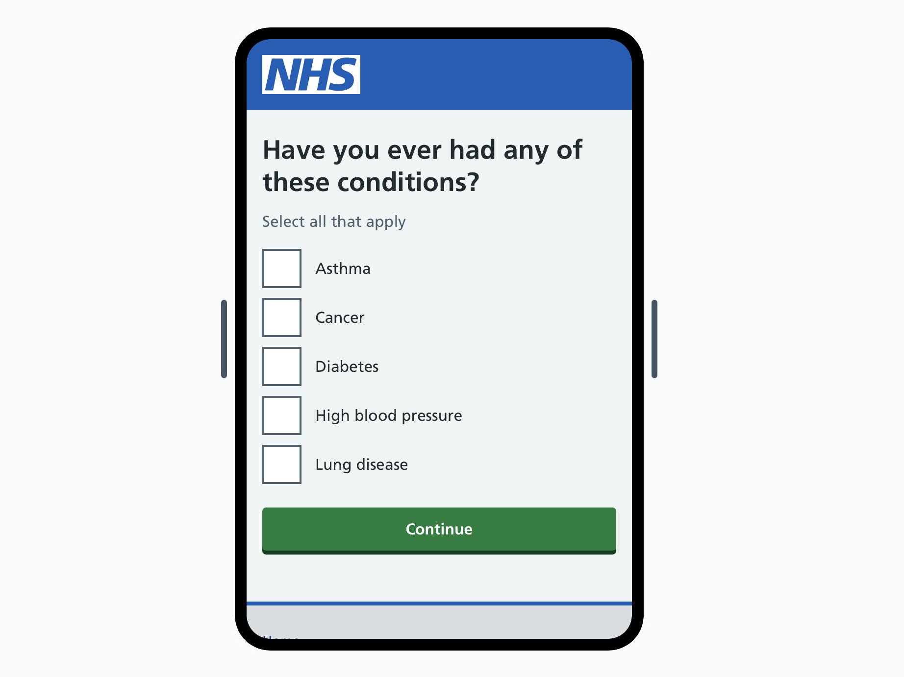
Add /frame to the end of your prototype URL, for example http://localhost:3000/frame.
You can resize the frame to approximate different phone and tablet sizes.
As you browse, the URL updates to include the current page and frame size. Share it with colleagues to let them review that page in the frame.